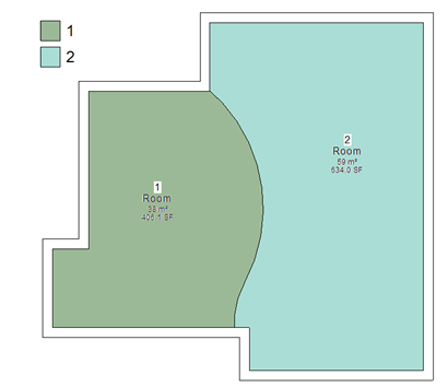
Room separating lines are a useful as well as essential elements. They allow you to sub-divide rooms into different areas. An example of this, is may be you have large open place office, but you need to sub-divide this into different departments or divisions. The room separator tool allows you to subdivide rooms.
If a room is already contained within the project, the room boundaries will adjust to reflect the new room separation lines. You can then add a new room to the new separated space. You can then apply a colour scheme to reflect these subdivisions on the floor plan.
All good stuff; but by default out of the box, room separating lines are drawn using black line work. To be honest this makes the tracking and location of room separating linework within a project, very awkward. Therefore, often its a good idea to amend the room separator line work style from black to an obvious colour, maybe red, green or blue and increase its default pen width to something larger so that's it obvious to see in a plan view. To do this, go to settings pulldown menu and line styles. Locate the line style called "Room Separation" and override these settings to something a bit more bold.
 Also, if you are using worksets, consider placing room separators on their own workset, to make the management and visibility control easier and more straight forward.


